 BI and OLAP reports share some commonalities. For example, at the presentation layer (what an end user sees), a static BI report is the same as a static OLAP report; regardless of its data source or underlying analytic engine, each must meet the user requirement that the report is pixel-perfect. Similarly, most reporting tools, regardless of whether they are for BI or OLAP, start with the concept of data organized in rows and columns. You select the criteria for what you want to display in the rows and columns, and the tool returns a report. Where BI and OLAP reports part ways is in how much freedom the end user has to interact with the data and format the presentation.


Figure 1. A custom Microsoft Office document with dynamic content
In discussing desirable functionality with web-based tools, consideration must be given to performance over a network, amount of images, caching, and comparisons between what users get on the desktop. As is commonly known, desktop tools typically deliver a richer and more interactive user experience for nearly all software.
In this section, we review some of the most desirable functionality in an OLAP reporting tool. We start with member selection and data aggregation, which is common to most BI and OLAP reporting tools. Then we move to OLAP-specific functionality, discussing pivoting and POV. Lastly, we explore how OLAP enables analysts to dig down into dimensions and create reports with data sets that are meaningful to the OLAP report consumer. Note that the screen captures in this section reflect a variety of software reporting tools, yet the basic capabilities are very similar. In many cases, business users need to view the data summarized, or in aggregate, to start to understand the underlying business issues.
Creating the Skeleton of a Report
All OLAP reports start with the selection of dimensions for the rows and columns. You might make this selection from a conventional selection tool similar to those used by BI tools or from an OLAP pivot table. In addition to rows and columns, OLAP reports often use filtering or POV options to focus the data to display. Let's begin with a look at conventional member selection.
Conventional Member Selection
Any basic BI reporting tool allows for the selection of members, fields, or columns, regardless of the data source with which you are working. The initial selection becomes the starting point for a query. In an OLAP reporting tool, the selection of members starts with the dimensions. For example, in Figure 2, an analyst has selected members from the Product, Scenario, and Measures dimensions as the initial query.
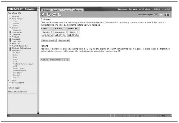
Figure 2. Standard selection of dimensions
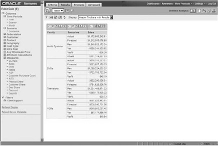
Figure 3. Results from the OLAP query
When the analyst processes the query, the resulting report displays the data for each of the selected dimension members. Figure 3 shows the results of a query displayed in a simple column format.
The next step may be to change the representation of the aggregated data, creating a grid, a graph, or a chart. Figure 4 shows a compound report containing a grid and a bar chart side by side. This type of compound report is one we see used very often, sometimes side by side, sometimes top to bottom, and sometimes with a toggle or drop-down window listing choices to let the consumers of the report choose the orientation that suits their needs.
Member Selection Using a Pivot Table
Where OLAP shines is when users are looking to go beyond static and traditional styles of reporting. You can truly empower end users to analyze data with interactive, free-form, speed-of-thought query responses. In effect, the end users can change what data is aggregated and displayed on the fly. Starting from a pivot table is a great way to do this. Members left in the filter area can then be used to make specific choices in other dimensions or separate POVs.
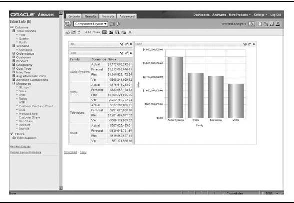
Figure 4. Results of the query displayed as a compound report
One main difference between a typical BI reporting tool and an OLAP reporting tool is that an OLAP report is more appropriately designed using a pivot table to create cross-dimensional displays. While a pivot table can also be used by relational tools, it is the best practice way to look at multiple dimensions at the same time.
For example, rather than just a cross-tab comparison of sales greater than 1,000, you can generate a report that shows product sales greater than 1,000 sorted by region, month, scenario, and customer category. It is this in-depth, multidimensional analysis that OLAP so easily conveys.
In a pivot table, you assign dimension members to both columns and rows, and you select at least one data element - a measure, account, or fact (like sales or units). The results are displayed in a grid format. This cross-dimensional view of data can allow for detailed analysis by adding more dimensions to both rows and/or columns.
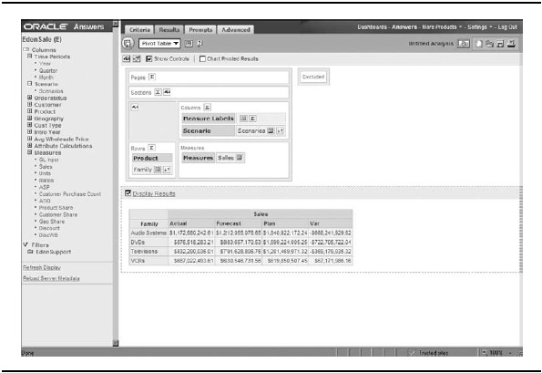
Figure 5. A pivot design layout
Figure 5 shows an example of a pivot table with the Product dimension assigned to rows and Scenario assigned to columns. In Figure 6, another example of a pivot table implementation shows the Scenario dimension assigned to rows and the Time Periods dimension assigned to columns.
Reports can be designed with multiple dimensions nested within each other in both rows and columns, so you get a full picture of the results by perspective.
Filters and Points of View
A report needs additional perspective for the data displayed, which is provided by filters. You can filter on the dimensions that are not in the rows or columns, such as sales amount or units. Items that are filters can be thought of as a POV for the report, and can be used to filter a single selection in the report. Filters can be driven from drop-down windows, parameter selections before running a report, or free-form selection by end users. It is a best practice to design reports that allow users to change their POV and alter the report to display only what they need to see.
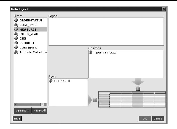
Figure 6. Another pivot design layout

Adding Functionality to a Report
Selecting dimension members for rows and columns and adding filters creates the skeleton of an OLAP report. Now you can add some muscle by selecting details to include in the report. This section covers dimension browsing, time-specific member selection, formatting, and some advanced options.
Dimension Browsing
To make more complex selections from a dimension, you need a tool that enables you to browse and select the members of a dimension. Figure 7 shows an OLAP dimension browser. Using the dimension browser, you can go into each dimension and browse the members until you find the ones you want to select, not just by picking members from a list, but also using functions like Parent, Children, Descendants,
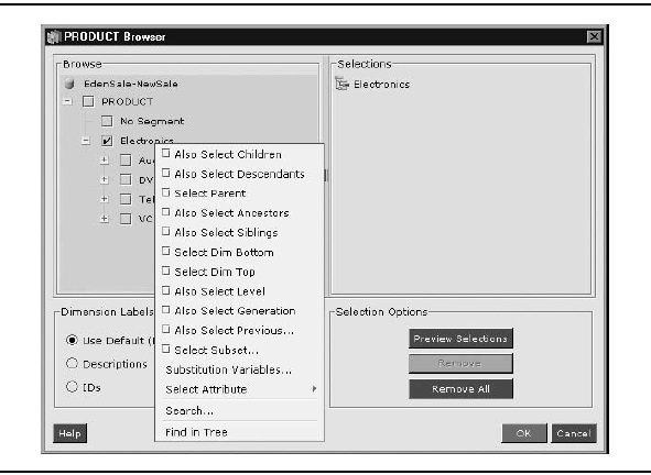
Figure 7. A dimension browser
Siblings, Dimension Bottom, and so forth. This is where the real OLAP advantage starts to show. You cannot easily do this level of specific complexity in a relational model.
OLAP allows you to select individual members from any level or combination of levels, or you can select a member and then include other members based on their relationship to a member. A powerful attribute of reporting tools that are designed to work with OLAP is that they help the end user with these concepts and guide the end user with the analysis, making it much easier to accomplish.
For example, with the dimension browser shown in Figure 7, you can right- click a member - in this case, Electronics - and display a context menu that contains the select-based-on-relationship options. Because Electronics has children of four different product types, the design that allows for the easiest report maintenance of this dimension would be to choose either Also Select Children or Also Select Descendants. If you choose Also Select Descendants, the report can query the cube for all members that appear beneath Electronics, regardless of ragged and changing hierarchies. This means that if anything ever changes in the product structure below Electronics, the report will still display it correctly.
Time-Specific Member Selection
Figure 8 shows another dimension selection window, this time with the functions displayed in a Functions tab. Let's take a look at the time-series functions shown at the bottom of the list: Year-to-Date (Y-T-D) and Quarter-to-Date (Q-T-D).
The time-series functions have been set up on the database, and they can be used in reports for dynamic update without needing to store these data points. Consider a report that lets a user choose a month via a prompt. The generated report has columns for that month, but because of the time-series functions, the report also includes the quarter-to-date information and the year-to-date data, both dynamically generated based on the month the user selects.
Grid Formatting
Once you have finished making your selections, you apply them and see the results returned as a grid. You then go into the aspect of applying formatting to your grid (spacing, fonts, headers, data display, and so on). You may have choices like those shown in Figure 9.
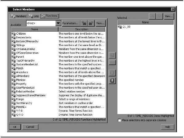
Figure 8. Time-specific functions
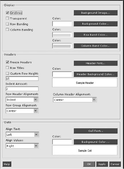
Figure 9. Grid display options for formatting
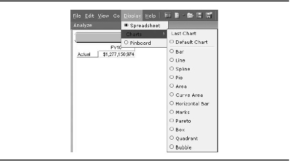
Figure 10. Chart display options
Charts
If you need to display more than a grid, many tools let you choose to display a chart instead of the grid or next to the grid. Available types are usually basic bar, line, pie, and area charts, and may include other specialized visualizations, such as bubble and quadrant. Figure 10 shows an example of the types of charts available with one reporting tool.
Custom Drill Paths
The default drill path generally follows the structure of the dimension hierarchy, so that drilling down expands the children of the selected member, while drilling up hides the selected member's children. A full-featured OLAP reporting tool is aware of the underlying analytic technology and offers the choice to drill to something other than children, such as all descendants, siblings, or levels. This flexibility in reporting and analysis is why OLAP is popular.
Advanced Analysis Options
Web-reporting tools offer a wide variety of analysis options. In addition to standard slice-and-dice analysis (retaining and removing dimensional slices), web-reporting tools may offer the following types of advanced analysis:
- "Traffic lighting" of cells to visually highlight important thresholds in the data
- Sorting
- Retrieval options (such as top five or bottom ten products)
- Thresholds to restrict data (such as show only members with data over a certain value)
- End -user calculations (such as when the calculation is not available from the database)
- Show or hide members based on criteria
- Advanced formatting options
As you can see, end users are given wide flexibility to do analysis, and are enabled to do it themselves, instead of being reliant on static reports.
Suppress Missing Data Values
A very useful feature for OLAP reporting is the ability to suppress missing data values. Because of the inherent sparsity of OLAP cubes, many combinations of members have no data value. The result can be reports with too many null values.
A suppress missing values feature provides an easy way to avoid taking up large amounts of screen real estate with null or empty cells returned from a symmetric result set. Such a feature may allow you to suppress missing rows, missing columns, or even zero rows (when the data stored is actually the numeral 0). This level of suppression selection again helps OLAP reporting be more flexible and stand out compared with relational reporting tools.
Display of Dimension Members
The last report item that is frequently requested in OLAP reporting is changing how a user can display the rows. This feature allows the end user to decide where the parent of a member is displayed - perhaps at the top or at the bottom of the list of members. For example, financial statements such as net income reports are typically made from dimensions that roll up, so the parent is best displayed below its children.