 Earlier in my blog, we mentioned that desktop-based reporting is most often done from within Microsoft Excel. This means that you can take advantage of many of the features that come standard with Excel, including formatting, sorting, and other spreadsheet-related functionality. When selecting a desktop-based reporting tool (instead of a web-based tools) - whether it is from Oracle, a third-party, or created in-house - you should make sure that you are getting the OLAP functionality you need to produce the types of reports you want.
Desirable functionality for desktop-based reporting includes:
- Integrated database connection for data retrieval, calculation, refresh, and write-back
- Powerful ad hoc analysis features, such as the ability to drill down on dimension hierarchies, pivot rows and columns, change the POV, and keep or remove subsets of data
- Easy report-creation tools, such as member selection, saved queries, and free-form reports
- Visualization tool to create charts and graphs based on the data in the spreadsheet
In the following blog, we review each group of features in more detail. We use two tools in our examples: Smart View and Discoverer Plus OLAP. Discoverer Plus OLAP is the OLAP component of Oracle Business Intelligence Discoverer Plus.
Integrated Database Connection
To perform an effective OLAP analysis, you need a connection to live multidimensional data. Therefore, your desktop-based reporting tool should provide an integrated way of connecting to databases. Desirable features include the ability to retrieve, calculate, and refresh data, as well as write back to the database (with the appropriate permission). For example, Smart View offers an integrated way to connect to Essbase databases and enables all of these data-related features. The features for running calculation scripts on the database and writing back to the database are restricted to users with the appropriate security permissions Figure 1 shows the Data Source Manager, which allows connection not just to Essbase, but also to Oracle BI Server content. Here, we will focus on Essbase as the data source.
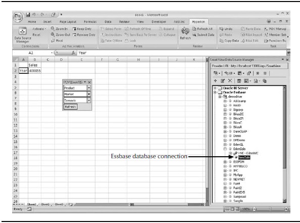
Figure 1. Smart View integrated database connection
Powerful Ad Hoc Analysis Features
In addition to standard spreadsheet features such as formatting and sorting, a competent ad hoc analysis tool should provide the following OLAP-related capabilities:
- Zooming in/out on dimension hierarchies
- Setting the POV
- Pivoting dimensions
- Retaining and removing dimensional slices
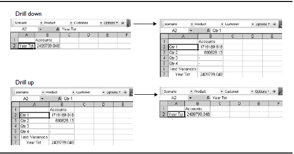
Figure 2. Navigation of hierarchies
Zooming In/Out on Dimension Hierarchies
A good desktop-based OLAP reporting tool makes it easy to explore a dimension hierarchy from within the spreadsheet. Look for the ability to zoom in/out (drill down/up) on a data cell. When you zoom in on a dimension member, you should see (by default) data for the children of the selected member. For example, if you zoom in on a Year dimension, data for the quarters is displayed in the spreadsheet. Drilling down on a quarter then reveals the months in the quarter. You should be able to reverse this process by zooming out.
More advanced tools will provide a way to modify what happens when you zoom in and out. For example, you may be able to show all descendants, instead of just the children, or to explore the siblings. In a hybrid architecture, you may want the ability to drill down to dimensional data stored in a relational source.
Figure 2 shows what happens when you zoom in on Year Tot and then zoom out using Smart View. Smart View makes zooming in/out as simple as double-clicking a cell. It supports changing the zoom actions, as well as drilling down to data in a relational source (requires Essbase Studio).
Changing the POV
As previously mentioned, a POV enables you to see a subset of data. A POV feature makes it easy to filter out extraneous data and focus in on what is important to you. The desktop-based reporting tool that you choose should offer a convenient and intuitive way to set and change the POV.

FIGURE 3. Smart View POV toolbar
Figure 3 shows the Smart View POV toolbar. The selections made in the POV toolbar control what data is displayed in the spreadsheet. In this example, the POV is set to show the net sales for the Lightbolt product only. You can select a new POV by using the drop-down lists on the POV toolbar.
Pivoting Dimensions
When following a path of investigation, it can be very useful to change the orientation and order of dimension data in the spreadsheet. Desirable pivoting features include the ability to perform the following actions:
- Pivot a dimension from a row to a column
- Pivot a dimension from a column to a row
- Pivot a dimension from the spreadsheet to the POV
- Pivot a dimension from the POV to a row or column
- Change the order of dimensions in the rows
- Change the order of dimensions in the columns
Figure 4 shows a sample spreadsheet and the results of several pivot actions related to the Current Year and Prior Year dimensions. On the bottom left, the selected dimensions are moved from the second column to the first column. On the upper right, the selected dimensions are pivoted from rows to columns. The bottom right shows what happens when the row order is then changed.
Slicing and Dicing
For effective OLAP analysis, you need to be able to remove dimensional slices (data subsets) without deleting individual cells. A dimensional slice is made up of one or
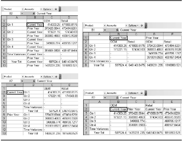
FIGURE 4. Pivot examples
more dimensions and/or dimension members. When a dimensional slice is selected, you should be able to choose whether to remove the slice from the data displayed or to display only the slice.
For example, Figure 5 shows the results of the Essbase Keep Only and Remove Only actions on a sample spreadsheet. In Smart View, you specify the dimensional slice by selecting the desired rows and columns in the spreadsheet.
In this case, the dimensional slice is made up of Qtr 1 and Qtr 2 (rows) and Performance and Value (columns). The image on the left shows the result of keeping only the slice; that is, the selected rows and columns are retained and everything else is removed from the spreadsheet. The image on the right shows what happens if the same slice is removed.
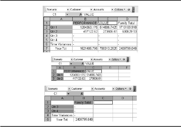
FIGURE 5. Examples of Keep Only and Remove Only in Smart View
Easy Report-Creation Tools
Ad hoc analysis takes time because you are exploring the dimension members and data as you build the report. A desktop-based tool that provides shortcuts for report creation and reuse can be invaluable. Desirable report-creation features may include the following:
- Member selection
- Query creation
- Free-form reports
Member-Selection Tool
When you are dealing with millions of members organized within dimensions, finding the members that you want in a report using only ad hoc features can be
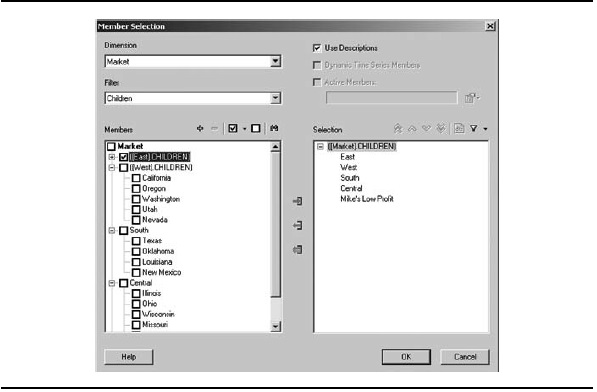
FIGURE 6. Member selection
a daunting task. A good member-selection tool can make the process faster and easier. At minimum, you need to be able to browse members by dimension and select multiple members at the same time. You may also want the ability to filter results, search for members, and specify conditions and criteria for member inclusion. The end result of your selection is a query that you can use to retrieve data from the database.
Figure 6 shows the Member Selection dialog box in Smart View, which offers all of the desired abilities.
Query Creation
After spending the time to create the query for a report, it would be useful to be able to save it and share it with others, without needing to save the data contained in the actual report. The saved query can be used to generate the report as exactly as designed, or the query can function as a quick starting point for creating new report queries.
With Smart View, you can create queries and save them to the server, allowing the query to be reused and shared with others. Figure 7 shows a simple report query with Market and Time dimensions assigned to rows and members of the Measures (or Accounts or Facts) dimension in columns. Note that you can also select a POV and attributes from the query window.
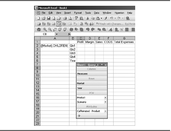
FIGURE 7. A report with a query designer
Some tools offer advanced query construction, where you can select conditions as well as members. For example, Figure 8 shows a query-creation tool from Discoverer Plus OLAP with an option to select the top ten items based on a variety of criteria.
Free-Form Reporting
Free-form reporting lets you converse with data in the connected database. The concept is straightforward. You enter the dimension or member names in the data cells of the spreadsheet, laying out the elements in the orientation you would like used for the report. A report is automatically generated from that information.
Free-form reporting is unique to Smart View. Figure 9 shows two ways to create a free-form report: specifying all dimensions/members or specifying some dimensions/members. If only some dimensions/members are included, Essbase completes the query and returns all other dimensions as top-level entries.
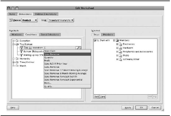
Figure 8. Query creation
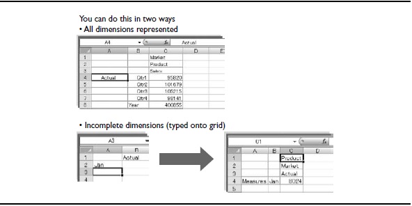
Figure 9. Free-form reporting techniques

Visualization
The notion of visualization has been around for years. Visualization provides a means by which you can gain insight into your data. For some, visualization can be a report that appears in their e-mail inbox or on a web page. For others, it could be a grid of numbers with a chart in Excel. The key is to provide the correct, most efficient approach to allow users to view what there is to see.
Grids (such as tables and spreadsheets) are a simple and very powerful form of visualization, but when it comes to presenting multidimensional OLAP results, they tend to take up a lot of real estate - so much real estate that you may need to scroll through subsets at a time. Because scrolling can be very time-consuming and tedious, important information may be overlooked, if ever even seen. Other kinds of visualization can enhance users' ability to interpret large sets of OLAP results. For example, the scatter plot is ideal for revealing patterns and anomalies in large data sets.
Here, we will go into some detail on visualization - starting with the limitations of traditional grids for OLAP querying and reporting, and then showing some effective visualization means you might consider for visualizing OLAP results.
Limitations of the Grid Format for OLAP Reporting
Not so long ago, people would run a report per a set of parameters and sift through the details. In some instances, data would be transferred to a spreadsheet for some additional analysis. Once in a spreadsheet, consumers could apply graphs to spot trends or color-coding to find outliers. With smaller amounts of data, these tasks were important, but basic.
OLAP analysis can produce very large sets of data. Analysts often miss important information, because the sheer amount of data can be overwhelming. Thus, decisionmaking suffers. Spreadsheets exacerbate this issue. Though spreadsheets are very user-friendly, the ability to store millions of cells by row and column inhibits the ability to see the entire data set at once.
It is far easier to spot trends, patterns, anomalies, and so on when you can examine the data in its entirety in a single view. If the data set is so large that you find yourself scrolling up and down and side to side, your analysis will suffer. It is virtually impossible to remember all of the data as you scroll. Enter the scatter plot.
From Grid to Scatter Plot
To meet the challenge posed by larger data sets, software vendors have begun creating new ways to query data that promote better visualization. In this section, we compare OLAP results in a grid format with the same data in a scatter plot. The demonstration starts with a small data set made up of sales and marketing data for a year. After you see how that data set maps to a scatter plot, we add the Market and Product dimensions to increase the size of the data set. Important information, hidden in the detail of a grid, becomes readily apparent in the scatter plot.

Figure 10. Sales and marketing values by month in a grid
Let's get started. Figure 10 shows OLAP results in a simple grid. In this case,
Smart View was used to query an Essbase database and populate an Excel spreadsheet. Grids show values explicitly. For example, cell B2 reflects the value associated with Jan Sales: $31,538. Figure 11 presents the same data in a scatter plot.
So, what is the difference? Well, instead of the 24 numbers shown in the grid, we see 12 data points in the scatter plot. The scatter plot still reflects all 24 values,
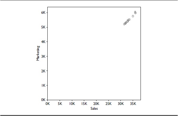
Figure 11. Sales and marketing by month in a scatter plot
except that the data is plotted by sales and marketing. This is a subtle but extremely powerful difference. In addition, instead of showing the numeric value in each cell, a plot point represents the value as an intersection with each axis. One drawback is that, initially, it may be difficult to discern which data point is which. We will demonstrate techniques to address this issue in the next section. But first, let's review how the scatter plot works. Then we will look at larger examples using the same size scatter plot object.
Creating plots in a scatter plot is a matter of simple geometry. In our example, each data point reflects a given month. So, to find the data point for sales and marketing for January, locate 31,538 on the x-axis (Sales) and draw a line upward, parallel to the y-axis. Locate 5,223 on the y-axis (Marketing) and draw a line to the right, parallel to the x-axis. As shown in Figure 12, the data point is found at the intersection of the two lines. The lines are sometimes referred to as drop lines.
Now that you have the basics, let's expand the data set to include market data. Figure 13 shows that as the domain size increases, the grid takes up more space. For each market, we need two rows by 12 columns to present 24 values. With 20 markets, we need 40 rows by 12 columns to present 480 values. In a scatter plot, the 20 additional markets are presented as 240 marks in the same space used before we introduced the additional markets, as shown in Figure 14.
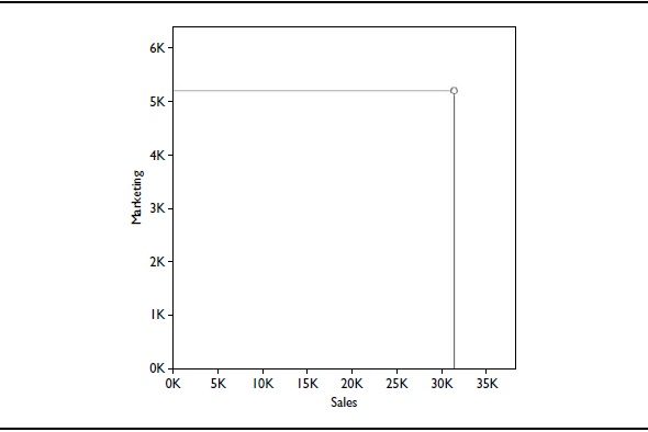
Figure 12. Sales and marketing by January
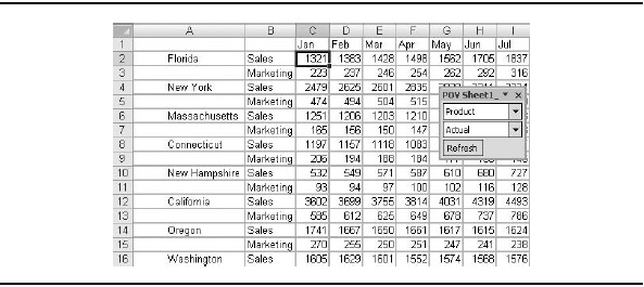
FIGURE 13. Sales and marketing by month by market in a grid
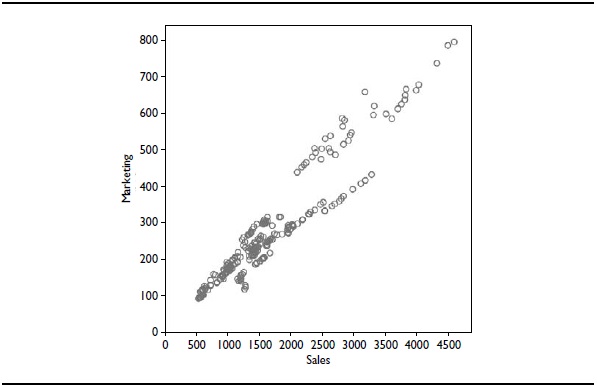
FIGURE 14. Sales and marketing by month by market in a scatter plot
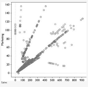
FIGURE 15. Sales and marketing by month by market by product in a scatter plot
When we add the Product dimension with its 12 members to the mix, the spreadsheet gets even larger and more unwieldy, while the scatter plot simply adds more data points. Figure 15 shows the scatter plot. (The spreadsheet version is too large to show.)
It may be useful to look at the progression of the scatter plots we have discussed. Figure 16 demonstrates the increased data points plotted as we add 20 markets,
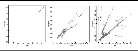
Figure 16. From 12 values to more than 2,700 values
followed by 12 products. Throughout, the footprint used remains the same. In contrast, the number of rows in the spreadsheet increases tremendously as we add markets and products.
More interesting though is the information that can be gleaned by a quick glance.
The rightmost scatter plot in Figure 16 has some stunning information. What appeared to be a consistent pattern has been broken, yielding very interesting data in both the upper-left and lower-right portions of the result. We refer to these anomalies as outliers, and their location in the scatter plot is critical. In this case, some of the outliers are good news and some are potentially bad news.
Considering that our analysis compares sales to marketing, the outliers found at the lower right are good news. These data points represent our ability to sell with little to no marketing expense. In contrast, the outliers found at the upper left warrant further investigation, because the opposite is true - the company is spending money on marketing with little return in sales. These outliers may be understandable; for example, a new product entering the market could have this kind of profile. If the product has been around for some time, however, this result is cause for attention.
Improving the Presentation of Data in a Scatter Plot
One challenge presented by the scatter plot is visibility. For example, it is hard to tell which market-by-product-by-time combination is associated with a given data point. To solve this problem, we can associate dimensional information with any combination of color, shape, size, and/or text. Color, shape, and size generally provide the most value. Text is nice to use with smaller sets of data. A legend is also important to aid comprehension. Another useful technique is to make the values along the axes suit the range of values contained in the chart. Let's take a look at a few examples.
Figure 17 presents a side-by-side view of our very first scatter plot - the one showing sales and marketing by month - with text labels added to each data point. The left chart reveals that, because the data points are clustered so close together, much of the text cannot be displayed. The solution, as shown in the right chart, is to use more appropriate axes values in order to provide the space necessary to display the text labels.
As you might guess, the challenge with text for larger data sets is that text uses a good deal of space. In essence, for larger data sets, the problem is the same one that led to using a scatter plot in the first place: lack of real estate. So, let's look at some other techniques for improving comprehension using larger data sets.
In the next example, we turn our attention away from months and focus on market. Figure 18 contains the scatter plot originally shown in Figure 15 (sales and marketing by month by market by product) with color assigned to the Market dimension. A legend maps a color to each of the markets.
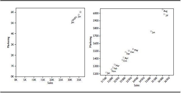
Figure 17. Text labels are used to identify months
NOTE
Now, by applying shape to product data in Figure 19, we can see other patterns emerge. Particular products are associated with the good and poor outliers. Referring to the legend, which contains a subset of information, we discover that Cola is the product that is selling very well in Massachusetts (good outlier). The poor performing product is Old Fashioned in New York State. With the information gleaned from increased visibility, we can contact the product managers for those markets and determine a course of action.

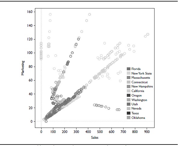
FIGURE 18. Adding color to markets causes a market-specific pattern to emerge.
Up to this point, we have used two measures, Sales and Marketing, on the x and y axes. Each data point represents the intersection of the values associated with these measures in terms of months, market, and products. We then highlighted markets with color and products with shapes. Now we are going to layer on yet another dimension member: ending inventory. We will use size to represent the value of the ending inventory - the larger the plot point, the greater number of units in inventory. Figure 20 confirms that in the poorest performing area (upper left), the data points are indeed larger than those found in the best performing area (lower right).
From Figure 20, we can conclude that we may be able to apply production capacity from the products at the upper left to the more profitable products at the lower right. After all, we are producing more product than we can possibly sell. In addition, if this excess inventory could be sold in the markets found at the lower right, a simple distribution change would help. In either case, having the information quickly provides us with the power to make a better decision.
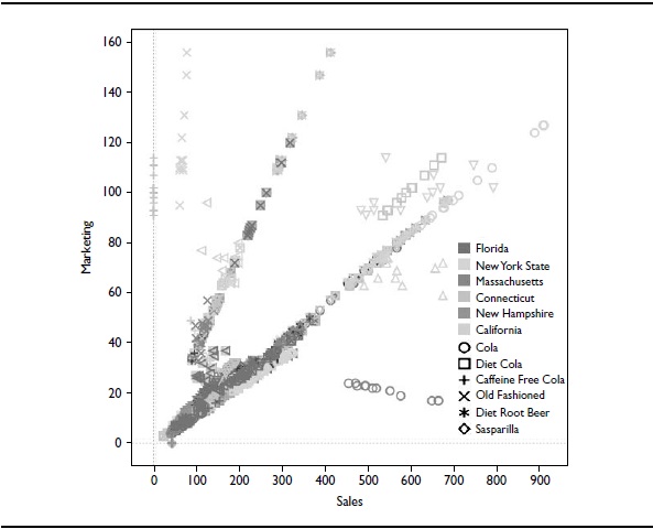
FIGURE 19. Adding shape to products reveals a product-specific pattern
The preceding examples demonstrated some basic functionality shared by many different visualization tools. We showed how properties such as shape, color, size, and text could be used to identify the data points and reveal patterns within the data. Most of what we demonstrated had to do with outliers. These values are simply anomalies that appear outside a typical pattern. Visualizations such as the scatter plot are great for this type of analysis.
Other Types of Visualizations
In general, visualizations should provide the most appropriate method for presenting the data, given the analytic need. Our intent was to present an alternative approach
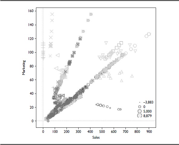
FIGURE 20. Size represents the value of ending inventory
to the grid- and chart-based methods. If you are simply after a report comparing this year to last, a grid or bar chart may fit the need. However, when heavy data volumes or no clear-cut output is needed - meaning the exercise is more analytic than static - other visualizations are a better fit. Both Oracle OLAP and Oracle Essbase can leverage Excel to perform similar tasks, allowing users to get more depth of analytics and insight, not just rows of data.
Many other types of visualizations are possible, including the following:
- Bar charts are a great way to compare data across categories or to break data down into stacked bars.
- Text tables (also called cross-tabs or pivot tables) provide an easy way to display the numbers associated with categorical data.
- Li ne charts connect individual data points in a data view. They provide a simple way to visualize a sequence of values, and they are especially useful when you want to see trends over time.
- Heat maps are a great way to compare categorical data using color. They are typically constructed as a table using colored squares to represent the data and a continuous range of colors. Heat maps allow you to see variations in the data via variations in color.
- Gantt charts are typically used when you want to display the duration of one or more categories of interest against the progression of time.
This section has covered the wide variety of functionality that you may want in a desktop-based OLAP reporting tool. Whichever tools you choose, ensure that you are getting the features you need to produce the types of ad hoc reports and custom reports that your users want.

