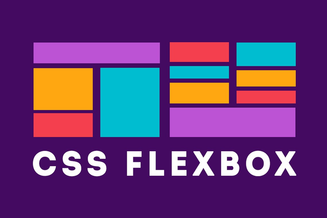

The first important notion to fully understand CSS is that of flex container, also known as container box. The element on which display: flex or display: inline-flex is applied becomes a flex formatting context for the containing box’s children, known as the flex container. Once we have created a flex container (by adding a display: flex or display: inline-flex), we need to learn how to manipulate the layout of the container’s children.
The children of this container box are flex items, whether they are DOM nodes, text nodes, or generated content. Absolutely positioned children of flex containers are also flex items, but they are sized and positioned as though they are the only flex item in the flex container.
We will first learn all about the CSS properties that apply to the flex container, including several properties impacting the layout of flex items.
The display property examples in Figure 1-6 show three flex items side by side, going from left to right, on one line. With a few additional property value declarations, we could have centered the items, aligned them to the bottom of the container, rearranged their order of appearance, and laid them out from left to right or from top to bottom. We could even have made them span a few lines.
Sometimes we’ll have one flex item, sometimes we’ll have dozens. Sometimes we’ll know how many children a node will have. Sometimes the number of children will not be under our control. We might have a varied number of items in a set-width container. We might know the number of items, but not know the width of the container. We should have robust CSS that can handle our layouts when we don’t know how many flex items we’ll have or how wide the flex container will be (think responsive). There are several properties outside of the new display values we can add to the flex container to provide control over layout that enable us to build responsive layouts and responsive widgets.
The display, flex-direction, flex-wrap, and flex-flow properties impact the ordering and orientation of the flex container. The justify-content, align-items, and align-content properties can be applied to the flex container to impact the alignment of the container’s children.
The flex-flow Shorthand Property
The flex-flow property lets you define the directions of the main and cross axes and whether the flex items can wrap to more than one line if needed.
flex-flow
Values: |
|
Initial value: |
|
Applies to: | Flex containers |
Inherited: | No |
Percentages: | Not applicable |
Animatable: | No |
The flex-flow shorthand property sets the flex-direction and flex-wrap properties to define the flex container’s wrapping and main and cross axes.
The default value of flex-direction is row. The default value of flex-wrap is nowrap. As long as display is set to flex or inline-flex, omitting flex-flow, flex-direction, and flex-wrap is the same as declaring any of the following three, which all mean the same thing:
flex-flow: row;
flex-flow: nowrap;
flex-flow: row nowrap;
In left-to-right writing modes, declaring any of the property values just listed or omitting the flex-flow property altogether will create a flex container with a horizontal main axis that doesn’t wrap, as shown in Figure 1. That’s not the look you’re going for. flex-flow can help. But you might be wondering why we’re introducing a shorthand property before you understand the component properties.

Figure 1. flex-flow: row;
While the specification’s authors encourage the use of the flex-flow shorthand, understanding flex-wrap and flex-direction, the two properties that make up this shorthand, is necessary. And, by learning about the values that make up the flex-flow shorthand, we’ll learn how to fix the unsightly layout shown in Figure 1.
The flex-direction Property
If you want your layout to go from top to bottom, left to right, right to left, or even bottom to top, you can use flex-direction to control the main axis along which the flex items get laid out.
flex-direction
Values: |
|
Initial value: |
|
Applies to: | Flex containers |
Inherited: | No |
Percentages: | Not applicable |
Animatable: | No |
The flex-direction property specifies how flex items are placed in the flex container. It defines the main axis of a flex container, which is the primary axis along which flex items are laid out.
Figure 2 shows the four values of flex-direction, including row, row-reverse, column, and column-reverse in left-to-right languages. Note that all flex properties discussed here, like all CSS properties, accept the global values of inherit, initial, and unset.

Figure 2. The four values of the flex-direction property when the language is left-to-right
We specified left-to-right languages, because the direction of the main axis for row—the direction the flex items are laid out in—is the direction of the current writing mode.
Preferably, we should have used the flex-flow shorthand property. The two right columns in Table 1 are equivalent, with the nowrap value being explained in the next section.
flex-direction | single-value flex-flow | flex-flow |
row | row | row nowrap |
row-reverse | row-reverse | row-reverse nowrap |
column | column | column nowrap |
column-reverse | column-reverse | column-reverse nowrap |
Table 1. The values for flex-direction and flex-flow equivalents | ||
Right-to-Left Languages
If you’re creating websites in English, or other left-to-right (LTR) language, you likely want the flex items to be laid out from left to right, and from top to bottom. Defaulting or setting row will do that. If you’re writing in Arabic, or another right-to-left language, you likely want the flex items to be laid out from right to left (RTL), and from top to bottom. Defaulting or setting row will do that for you too.
flex-direction: rowwill lay the flex items in the same direction as the text direction, also known as the writing mode, whether it’s a RTL or LTR language. While most websites are presented in left-to-right languages, some sites are in right-to-left languages, and yet others are top to bottom. With flexbox, you can include a single layout. When you change the writing mode, flexbox takes care of changing the flex direction for you.The writing mode is set by the
writing-mode,direction, andtext-orientationproperties or the dir attribute in HTML. When the writing mode is right to left—whether set in HTML with thedir="rtl"attribute/value pair or via CSS withdirection: rtl;—the direction of the main axis, and therefore the flex items within the flex container, will go from right to left by default or when theflex-direction: rowis explicitly set.
You can reverse this default direction with flex-direction: row-reverse.
The flex items will be laid out from top to bottom when flex-direction: column is set, and from bottom to top if flex-direction: column-reverse is set, as shown in Figure 2. Note if the CSS direction value is different from the dir attribute value on an element, the CSS property value takes precedence over the HTML attribute.
Note
Do not use
flex-directionto change the layout for right-to-left languages. Rather, use the dir attribute, or thewriting-modeCSS property, which enables switching between horizontal and vertical, to indicate the language direction.
In horizontal writing modes, which includes left-to-right and right-to-left languages, setting flex-direction: row, flex-flow: row, flex-flow: row nowrap, or omitting both the longhand and shorthand properties so it defaults to row will set all the flex items horizontally, side to side. By default, they will all be aligned horizontally, along the main-axis line, in source order. In left-to-right languages, they will be aligned from left to right: the left side is referred to main-start and the right is main-end, for the start and end points of the main-axis. In right-to-left languages, the main direction is reversed: the flex items are side by side from right to left, with the main-axis going from left to right, the right side being main-start and left being main-end.
The row-reverse value is the same as row, except the flex items are laid out in the opposite direction of the text direction: the start and end points are reversed. The direction of the main-axis of the flex container is reversed by the row-reverse value. For left-to-right languages, like English, row-reversewill lay out all the flex items side to side from right to left, horizontally, with main-start being on the right and main-end now on the left. These are shown in the top two image examples in Figure 2.
Had the direction of the page or flex container been reversed, such as for Hebrew or Arabic, with the attribute dir="rtl"on the flex container or an ancestor in the HTML, or with direction: rtl on the flex container or container’s ancestor in the CSS, the direction of the row-reverse main axis, and therefore the flex items, would be inverted from the default, going left to right, as shown in Figure 3. Similarly, the writing-mode property impacts the direction in which the flex items are drawn to the page.

Figure 3. The four values of the flex-direction property when direction is right to left, demonstrated here with display: inline-flex
The column value will lay out the flex items from top to bottom. The column value sets the flex container’s main-axis to be the same orientation as the block axis of the current writing mode. This is the vertical axis in horizontal writing modes and the horizontal axis in vertical writing modes. Basically, it sets the flex-container’s main-axis to vertical in most cases.
There are vertically written languages, including Bopomofo, Egyptian hieroglyphs, Hiragana, Katakana, Han, Hangul, Meroitic cursive and hieroglyphs, Mongolian, Ogham, Old Turkic, Phags Pa, Yi, and sometimes Japanese. These languages are only vertical when a vertical writing mode is specified. If one isn’t, then all of those languages are horizontal. If a vertical writing mode is specified, then all of the content is vertical, whether one of the listed vertically written languages or even English.
Note
The
writing-modecontrols the block flow direction: the direction in which lines and blocks are stacked. The default value,horizontal-tb, stacks them top to bottom. The other values stack them right to left or left to right.
The direction controls the inline “base direction,” the direction in which content within a line is ordered. LTR, short for “left to right,” goes from nominal “left” to nominal “right”. RTL, short for “right to left”, is the opposite. Which side is nominally “left” for the purpose of direction is affected by the writing mode: if the writing mode is vertical, the “left” side might be the top!
The inline base direction is and should always be a property of the content. Use the dir attribute in HTML. Do not use the CSS direction property. The writing-mode is a layout preference. Chinese, Japanese, and Korean can be written in either orientation. While English is a top-to-bottom, left-to-right language, you will sometimes see and may even use vertical writing for stylistic effect.
With column, the flex items are displayed in the same order as declared in the source document, but from top to bottom instead of left to right, so the flex items are laid out one on top of the next instead of side by side:
nav {
  display: flex;
  flex-direction: column;
  border-right: 1px solid #ccc;
}
a {
  margin: 5px;
  padding: 5px 15px;
  border-radius: 3px;
  background-color: #ccc;
  text-decoration: none;
  color: black;
}
a:hover, a:focus, a:active {
  background-color: #aaa;
  text-decoration: underline;
}
Using similar markup to our preceding navigation example, by simply changing a few CSS properties, we can create a nice sidebar-style navigation.
For the navigation’s new layout, we changed the flex-direction from the default row to column, moved the border from the bottom to the right, and changed the colors, border-radius, and margin values, as seen in Figure 4.

Figure 4. Changing flex-direction can completely change the layout of your content
Top-to-Bottom Languages
For top-to-bottom languages, like Japanese, when
writing-mode: horizontal-tbis set and supported, the main-axis is rotated 90 degrees clockwise from the default left to right, soflex-direction: rowgoes from top to bottom andflex-direction: columnproceeds from right to left, as shown in Figure 5.The
writing-modeproperty specifies the block flow direction, defining whether lines of text are laid out horizontally or vertically and the direction in which blocks progress. It defines the direction in which block-level containers are stacked and the direction in which text and other inline-level content flows within a block container. It is appropriate to usewriting-modefor top to bottom languages, and to rotate text. Don’t usewriting-modeto override the direction simply for layout reasons: instead, use theflex-directionproperty.

Figure 5. The four values of flex-direction property when writing mode is horizontal-tb
The column-reverse value is similar to column, except the main axis is reversed, with main-start being at the bottom, and main-end being at the top of the vertical main-axis, going upward, as laid out in the bottom-right example in Figure 3.
The reverse values only change the appearance. The speech order and tab order remains the same as the underlying markup.
What we’ve learned so far is super powerful and makes layout a breeze. If we include the navigation within a full document, we can see how simple layout can be with flexbox.
Let’s expand a little on our preceding HTML example, and include the navigation as a component within a home page:
<body>
<header>
<h1>My Page's title!</h1>
</header>
<nav>
<a href="/">Home</a>
<a href="/about">About</a>
<a href="/blog">Blog</a>
<a href="/jobs">Careers</a>
<a href="/contact">Contact Us</a>
</nav>
<main>
<article>
<img alt="" src="/img1.jpg">
<p>This is some awesome content that is on the page.</p>
<button>Go Somewhere</button>
</article>
<article>
<img alt="" src="/img2.jpg">
<p>This is more content than the previous box, but less than
the next.</p>
<button>Click Me</button>
</article>
<article>
<img alt="" src="/img3.jpg">
<p>We have lots of content here to show that content can grow, and
everything can be the same size if you use flexbox.</p>
<button>Do Something</button>
</article>
</main>
<footer>Copyright © 2017</footer>
</body>By simply adding a few lines of CSS, we’ve got a nicely laid out home page, as shown in Figure 6:
* {
  outline: 1px #ccc solid;
  margin: 10px;
  padding: 10px;
}
body, nav, main, article {
  display: flex;
}
body, article {
  flex-direction: column;
}
It took only two CSS property/value declarations to create the basic layout for a site home page.
Obviously there was some additional CSS. We added border, margin, and padding to all the elements so you can differentiate the flex items for the sake of learning (I wouldn’t put this less-than-attractive site in production). Otherwise, all we’ve done is simply declare the body, navigation, main, and articles as flex containers, making all the navigation, links, main, article, images, paragraphs, and buttons flex items. Yes, elements can be both flex items while being flex containers, as we see with the navigation, main, and articles in this case. The body and articles have column set as their flex directions, and we let nav and main default to row. Just two lines of CSS!

Figure 6. Home page layout using flex-direction: row and column
But what happens when the flex items’ main-dimension (their combined widths for row or combined heights for column) don’t fit within the flex container? We can either have them overflow, as shown in Figure 1, or we can allow them to wrap onto additional flex lines.
The flex-wrap Property
Thus far, the examples have shown a single row or column of flex items. If the flex items’ main-dimensions don’t all fit across the main-axis of the flex container, by default the flex items will not wrap. Rather, the flex items may shrink if allowed to do so via the flex item’s flex property and/or the flex items may overflow the bounding container box.
You can control this behavior. flex-wrap can be set on the container to allow the flex items to wrap onto multiple flex lines—rows or columns of flex items—instead of having flex items overflow the container or shrink as they remain on one line.
The flex-wrap property controls whether the flex container is limited to being a single-line container or is allowed to become multiline if needed. When the flex-wrap property is set to allow for multiple flex lines, whether the value of wrapor wrap-reverse is set determines whether any additional lines appear either before or after the original line of flex items.
flex-wrap
Values: | nowrap | wrap | wrap-reverse |
Initial value: | nowrap |
Applies to: | Flex containers |
Inherited: | No |
Percentages: | Not applicable |
Animatable: | No |
By default, no matter how many flex items there are, all the flex items are drawn on a single line. This is often not what we want. That’s where flex-wrap comes into play. The wrap and wrap-reverse values allow the flex items to wrap onto additional flex lines when the constraints of the parent flex container are reached.
Figure 7 demonstrates the three values of the flex-wrap property when the flex-direction value is defaulting to row. When there are two or more flex lines, the second line and subsequent flex lines are added in the direction of the cross-axis.
Whether the additional flex lines are added above or below, as in the case of Figure 7, or to the left or to the right of the previous line is determined by whether wrap or wrap-reverse is set, by the flex-direction value, and by the writing mode.
Generally for wrap, the cross-axis goes from top to bottom for row and row-reverse and the horizontal direction of the language for column and column-reverse. The wrap-reverse value is similar to wrap, except that additional lines are added before the current line rather than after it.
When set to wrap-reverse, the cross axis direction is reversed: subsequent lines are drawn on top in the case of flex-direction: row and flex-direction: row-reverse and to the left of the previous column in the case of flex-direction: column and flex-direction: column-reverse. Similarly, in right-to-left languages, flex-flow: row wrap-reverse and flex-flow: row-reverse wrap-reverse, new lines will also be added on top, but for flex-flow: column wrap-reverse and flex-flow: column-reverse wrap-reverse new lines will be added to the right—the opposite of the language direction or writing mode, the direction of the inverted cross-axis.

Figure 7. The three values of the flex-wrap property
You may notice that in Figure 7, the new lines created in the wrap and wrap-reverse examples are not the same height as the first line. Flex lines are as tall or wide as their tallest or widest flex item within that line. The flex line’s main dimension is the main dimension of the flex container, while the flex line’s cross dimension grows to fit the cross-size of the flex item with the largest cross-size.
While the examples thus far are fairly simple, as you may have noticed from the two previous paragraphs, fully understanding all the complexities of flexbox is not. The preceding explanation introduced possibly confusing terms like main-axis, main-start, and main-end and cross-axis, cross-start, and cross-end. To fully grasp flexbox and all the flexbox properties, it is important to understand.
To understand flex layout you need to understand the physical directions, axes, and sizes affecting the flex container and its flex items. Fully understanding what the specification means when it uses these terms will make fully understanding flexbox much easier.
Understanding axes
Flex items are laid out along the main-axis. Flex lines are added in the direction of the cross-axis. The “main-” terms have to do with flex items. The “cross-” terms come into play on multiline flex containers: when wrap or wrap-reverse is set and the flex items actually wrap onto more than one line.
Up until we introduced flex-wrap, all the examples had a single line of flex items. That single line of flex items involved laying out the flex items along the main axis, in the main direction, from main-start to main-end. Depending of the flex-direction property, those flex items were laid out side by side, top to bottom or bottom to top, in one row or column along the direction of the main axis.
Table 2 summarizes the “main-” and “cross-” terms. It lists the dimensions and directions of the main-axis and cross-axis, along with their start point, end points, and directions for left-to-right writing mode layouts. In addition to describing the dimensions and direction of the flex container, these terms can be used to describe the direction and dimension of individual flex items.
Table 2. Dimensions and directions of the main- and cross-axis, along with their start point, end points, and directions in left-to-right layout
| Flex directions in left-to-right (LTR) writing modes | |||
row | row-reverse | column | column-reverse | |
main-axis | left to right | right to left | top to bottom | bottom to top |
main dimension | horizontal | horizontal | vertical | vertical |
main-start | left | right | top | bottom |
main-end | right | left | bottom | top |
main-size | width | width | height | height |
cross dimension | vertical | vertical | horizontal | horizontal |
cross-start | top | top | left | left |
cross-end | bottom | bottom | right | right |
cross-size | height | height | width | width |
In the case of flex-flow: row (Figure 1), the sum of the main-sizes of the nonwrappable line of flex items was greater than the main-size of the flex container parent. In plainer English, the combined widths (and noncollapsed horizontal margins) of the flex items was wider than the width of the flex container.
In horizontal writing modes, for row and row-reverse, the main size refers to the widths of the flex items and flex container. In the case of column and column-reverse, the main size is height.
Figure 8 shows the axes and the direction of each axis for flex containers with a flex-direction of row, row-reverse, column, and column-reverse for LTR writing modes.

Figure 8. Axes for row, row-reverse, column, and column-reverse in LTR languages
The main-axis is the primary axis along which flex items are laid out, with flex items being drawn along the main-axis in the direction of main-start to main-end.
If all writing modes were from left to right and top to bottom, like in English, flex-direction would be less complex. For both RTL and LTR languages, flex-direction: row and flex-direction: row-reverse the main-axis is horizontal. For LTR languages, in the case of row, the main-start is on the left, and main-end is on the right. They’re inverted for row-reverse, with the main-start switching to the right and main-end now on the left. For column, the main axis is vertical, with main-start on top and main-end on the bottom. For column-reverse, the main-axis is also vertical, but with main-start on bottom and main-end is on the top.
As shown in Table 3, when the writing mode is right to left, like in Arabic and Hebrew, if you have dir="rtl" set in your HTML, or direction: rtl set in your CSS, the direction of the text will go from right to left. In these cases, the direction of row is reversed to be from right to left with main-start on the right and main-end on the left. Similarly, the main-axis for row-reverse will go from left to right, with main-start being on the right. For column, the main-start is still on the top and main-end is on the bottom, just like for left-to-right languages, as both are top-to-bottom languages.
Table 3. Dimensions and directions of the main- and cross-axis, along with their start points, end points, and directions when writing mode is right to left
| Flex directions in RTL writing modes | |||
row | row-reverse | column | column-reverse | |
main-axis | right to left | left to right | top to bottom | bottom to top |
main dimension | horizontal | horizontal | vertical | vertical |
main-start | right | left | top | bottom |
main-end | left | right | bottom | top |
main-size | width | width | height | height |
cross dimension | vertical | vertical | horizontal | horizontal |
cross-start | top | top | right | right |
cross-end | bottom | bottom | left | left |
cross-size | height | height | width | width |
If your site has writing-mode: horizontal-tb set, as in Figure 5, the main-axis of the content for row and row-reverse will be vertical, while column and column-reverse are horizontal. The writing-mode property is starting to get support in browsers, with support in Edge and Firefox, prefixed support in Chrome, Safari, Android, and Opera, and support for an older syntax in Internet Explorer.
Note
While the CSS
directionproperty along with unicode-bidi can be used to control the direction of text, don’t do it. It is recommended to use the dir attribute and CSSwriting-modeproperty because HTML’s dir attribute concerns HTML content, and thewriting-modeproperty concerns layout.
It’s important to understand things get reversed when writing direction is reversed. Now that you understand that, to make explaining (and understanding) flex layout much simpler, we’re going to make the rest of the explanations and examples all be based on left-to-right writing mode, but will include how writing mode impacts the flex properties and features discussed.
How your flex layout appears on the screen is determined in part by interactions between flex-flow - which includes flex-direction and flex-wrap - and the writing mode. We’ve covered the direction in which flex items are added to a line of flex items, but when the end of the flex line is reached, how are new flex lines added?
When thinking about flex-direction, we now know the flex items are going to start being laid out across the main axis of the flex container, starting from the main-start. The “cross-” directions come into play when it comes to adding additional lines of flex items, known as flex lines. When the flex-wrap property is used to allow the container to wrap if the flex items don’t fit onto one line, the cross directions determine the direction of additional lines in multiline flex containers.
While the laying out of the flex items on each flex line is done in the main direction, going from main-start to main-end, the wrapping to additional lines is done along the cross direction, from cross-start to cross-end.
The cross-axis is perpendicular to the main-axis. As we see in Figure 9, when we have horizontal rows of flex items, the cross-axis is vertical. Flex lines are added in the direction of the cross-axis. In these examples, with flex-flow: row wrap and flex-flow: row-reverse wrap set on horizontal languages, new flex lines are added below preceding flex lines.
The cross-size is the opposite of main-size, being height for rowand row-reverse and width for column and column-reverse in both RTL and LTR languages. Flex lines are filled with items and placed into the container, with lines added starting on the cross-start side of the flex container and going toward the cross-end side.

Figure 9. Flex lines on row and row-reverse when flex-wrap: wrap is set
The wrap-reverse value inverts the direction of the cross-axis. Normally for flex-direction of row and row-reverse, the cross-axis goes from top to bottom, with the cross-start on top and cross-end on the bottom, as shown in Figure 9. When flex-wrap is set to wrap-reverse, the cross-start and cross-end directions are swapped, with the cross-start on the bottom, cross-end on top, and the cross-axis going from bottom to top, as shown in Figure 7. Additional flex lines get added on top of, or above, the previous line.
If the flex-direction is set to column or column-reverse, by default the cross-axis goes from left to right in left-to-right languages, with new flex lines being added to the right of previous lines. As shown in Figure 10, when flex-wrap is set to wrap-reverse, the cross-axis is inverted, with cross-start being on the right, cross-end being on the left, the cross-axis going from right to left, with additional flex lines being added to the left of the previously drawn line.

Figure 10. Flex lines on column and column-reverse when flex-wrap: wrap-reverse is set
Note
We added
align-items: flex-startandalign-content: flex-startto the flex container in Figures 9 and 10 to enunciate the height and directions of the flex lines. These properties are covered in the following sections.
The flex-wrap property seemed fairly intuitive when it was first described. It turned out to be a bit more complex than it might have originally seemed. You may never implement reversed wrapping in a right-to-left language, but this is a “Definitive Guide.” Now that we have a better understanding of the “cross-” dimensions, let’s dig deeper into the flex-wrap property.
flex-wrap continued
The default value of nowrap prevents wrapping, so the cross- directions just discussed aren’t relevant when there is no chance of a second flex line. When additional lines are possible—when flex-wrap is set to wrap or wrap-reverse — those lines will be added in the cross direction, which is perpendicular to the main-axis. The first line starts at the cross-start with additional lines being added on the cross-end side.
The wrap-reverse value inverts the direction of the cross-axis. Normally for flex-direction of row and row-reverse, the cross-axis goes from top to bottom, with the cross-start on top and cross-end on the bottom. When flex-wrap is wrap-reverse, the cross-start and cross-end directions are swapped, with the cross-start on the bottom, cross-end on top, and the cross-axis going from bottom to top. Additional flex lines get added on top of the previous line.
You can invert the direction of the cross-axis, adding new lines on top or to the left of previous lines by including flex-wrap: wrap-reverse. In Figures 9, 10, and 11, the last example in each is wrap-reverse. You’ll notice the new line starts at the main-start, but is added in the inverse direction of the cross-axis set by the flex-direction property.
In Figure 11, the same flex-wrap values are repeated, but with a flex-direction: column property value instead of row. In this case, the flex items are laid out along the vertical axis. Just as with the first example in Figure 7, if wrapping is not enabled by the flex-wrap property, either because flex-wrap: nowrap is explicitly set on the container, or if the property is omitted and it defaults to nowrap, no new flex lines will be added, even if that means the flex items are drawn beyond the bounding box of the flex container.
With column, just like with row, if the flex items don’t fit within the flex container’s main dimension, they’ll overflow the flex container, unless explicitly forced with min-width: 0 or similar, in which case they shrink to fit, though flex items will not shrink to smaller than their border, padding and margins combined.
When "flex-direction: column; flex-wrap: wrap;" or "flex-flow: column wrap;" is set on a flex container, the flex item children are aligned along the main-axis. In LTR modes, the first flex item is placed in the top left, which is the main-start and cross-start respectively. If there is room, the next item will be placed below it, along the main-axis. If there isn’t enough room, the flex container will wrap the flex items onto new lines. The next flex item will be put on a new line, which in this case is a vertical line to the right of the previous line, as can be observed in the flex-flow: column wrap example, the top-right example in Figure 11.

Figure 11. The three values of flex-wrap property with a column flex-direction
Here, the flex items have wrapped onto 3 lines. The flex items are wrapping onto new lines as the height: 440px was set on the parent. Including a height forces the creation of new flex lines when the next flex item will not fit onto the current flex line.
As shown in the bottom-right example in Figure 11, when we include "flex-direction: column; flex-wrap: wrap-reverse;" or "flex-flow: column wrap-reverse;" and the main-axis is the vertical axis, flex items are added below the previous flex item, if they can fit within the parent container. Because of the wrap-reverse, the cross-axis is reversed meaning new lines are added in the opposite direction of the writing mode. As shown in this example and in Figure 10, with wrap-reverse, columns are laid out right to left, instead of left to right. The first column of flex items is on the leftmost side of the parent flex container. Any additional required columns will be added to the left of the previous column. Again, we’re assuming a left-to-right default writing mode for all the examples.
In this example, the flex items are different heights based on their content. When divided across three lines, the last line is not filled. Since subsequent lines are being added to the left of previous lines, the empty space, if there is any, will be on the bottom left (assuming justify-content, described next, is set or defaults to flex-start).
As you can see, flex-direction and flex-wrap have great impact on your layout and on each other. Because it’s generally important to set both if you’re going to set either, we are provided with the flex-flow property, which is simply shorthand for flex-direction and flex-wrap.
Flex Line Cross Dimension
Similar to the display examples in Figure 1-6, in the flex-flow example in Figure 1, the flex items grew to fill the cross dimension of the flex line they were on. Because they default to nowrap, all the flex items will be on a single line. With other flex properties defaulting to their default values, the flex items are stretched filling the container.
In the flex-wrap example in Figure 7, we had two flex lines. All the flex items in a single line were the same height, but the individual flex lines were not of the same height: instead all the flex items were as tall as the tallest flex item within that same flex line.
By default, all flex items will appear to be the same height. We controlled this in Figures 9 and 10 in order to highlight the how flex lines are drawn. This stretching (or overwriting of that stretching) is caused by the stretch default value of the justify-content property, described in the next section.
In those examples, you’ll note the second row is not as wide as the flex container. When flex items are allowed to wrap onto multiple lines, by default all the items on one line will have the same cross dimension, which means all the items in a flex line of row and row-reverse will be the same height and all the items in a flex line of column or column-reverse will have the same width.
Figure 12 is an example in which flex-flow: column-reverse wrap-reverse is set. This means the main-axis is vertical, going bottom to top with a horizontal cross-axis going from right to left. Notice the extra space on the top left. New flex items get placed to the top of the previous ones, with new lines wrapping to the left of the previously filled row. By default, no matter the values of flex-flow, the empty space, if there is any, will be in the direction of main-end and cross-end. There are other flex properties that will allow us to alter that. Let’s look into those.

Figure 12. No matter the value of flex-flow, the empty space will be in the direction of main-end and cross-end